As I write this blog, our friends to the south are still recounting ballots in several states, with lawyers poised to fight over what voters intended.
For those of you who’ve read my book Do Good Design, you know that I believe the most influential piece of design in my lifetime has been the horrible information design of the Palm Beach County ballot of the U.S. presidential election in 2000, and you’ve seen the examples I show of how it hasn’t gotten any better since.
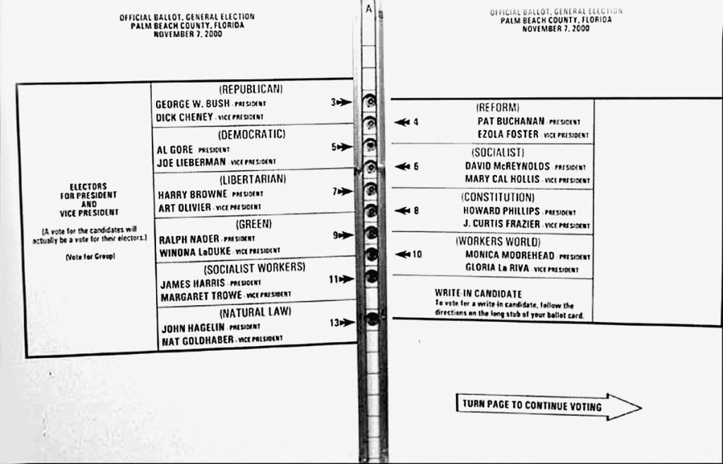
As related in Do Good Design, the most influential piece of information design in my lifetime may very well be the butterfly ballot used in Palm Beach County for the November 2000 U.S. presidential election. The number of votes mistakenly cast for independent Pat Buchanan instead of Al Gore, due to the misleading layout, was well in excess of George W. Bush’s certified margin of victory in Florida, and enough to result in Bush winning the presidency nationally. The poor design of this ballot is therefore likely responsible for the failure of the United States to sign the Kyoto Accord on climate change, the 2003 invasion of Iraq in search of weapons of mass destruction, and a long list of controversial White House decisions during the eight years that followed.

Palm Beach County ballot, Florida, 2000: even Pat Buchanan was shocked at his proportion of the Jewish and black vote. With many pages of voting ( 11 offices, 9 judicial contests, and 4 referenda) to complete, many voters wrongly marked the second hole from the top to indicate their “Democratic” intention
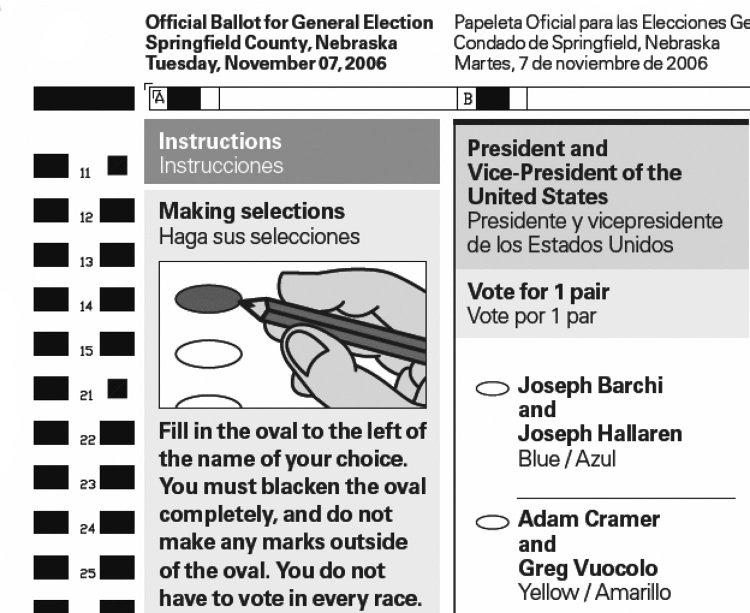
AIGA’s Design for Democracy has worked with the U.S. government to clean up the ballot mess. As a result of its efforts, in June 2007, the U.S. Election Assistance Commission issued voluntary guidelines for the effective use of design in administering federal elections. However, in the 2008 election, its recommendations were only reflected in the ballot design of perhaps six states, and it is still unclear what effect the recommendations had on the 2012 vote, but here’s an example of an issue with an electronic ballot used in the 2012 election. The U.S. continues to have thousands of different ballot designs, with varied technologies, for electing one president.

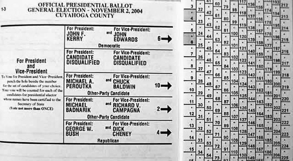
Not the solution: it was just as difficult to vote for George W. Bush for president in Ohio in 2004.14 Voting for Kerry was easy: mark box 6. But how do you vote for President Bush?
Voters should be provided with a consistently formatted ballot, created by information design experts. In Canada, as in most Western democracies (let alone in countries like Afghanistan and Iraq, which ironically provide their citizens clearer ballots that the U.S. does), anything other than a professional and consistent national ballot design would be an affront. It is odd that, by law, the United States Food and Drug Administration requires a standard format for nutritional facts on every one of thousands of food package designs, while the U.S. government fails to legislate the use of a standardized, well-designed ballot and voting procedures across its 51 states and districts.

One of many sample ballots created by AIGA’s Design For Democracy for the U.S. Election Assistance Commission
South Africa got it right the first time in its 1994 election. The vast majority had not voted before and a substantial portion of its citizens were illiterate. A simple ballot including candidate photos worked well. The influence of design on election outcomes does not stop at the ballot box. Candidates spend most of their war chests on ads. Many of these messages are oversimplified and intentionally misleading, cunningly combining pictures and words out of context. Advertising Age columnist Bob Garfield admits, “Political advertising is a stain on our democracy. It’s the artful assembling of nominal facts into hideous, outrageous lies.”
Sadly, what we take for granted in Canada (one clear ballot design for the entire country, easily created, easily completed, easily counted, easily audited) is quite different from the hodgepodge we see in the U.S. For a country that has so often led the world at developing delightfully simple interfaces (read Apple) and efficient standards that are adopted worldwide through creative destruction, one is left wondering what powers stand to benefit from a system of unnecessary complexity and advertising of often-intentional confusion.
If fact, for the first time ever, the U.S. election was audited by international observers from the European Union and Asia concerned that the election would not be run fairly.
So how can we get the U.S. to get the design thinking it needs, which will result in a better world for all? We’ve got two years till the midterm elections. If you believe that design can create a better world then let’s figure this out: there are few things more influential to the future of human civilization than how the world’s most powerful federation is governed.
Reviewed November 11, 2012