Here is information for speakers bureaus on David Berman and his presentations. In his keynote speeches David Berman provides your audience with the power to be better: fresh ideas and achievable techniques to get the most important things done well, in alignment with your mission and values. The combination of his inspiration and experience motivate people to create unique and ecologically-responsible strategies, events, branding, design, ethics, and communications solutions. He shares knowledge and experience one-on-one or through keynote speeches and courses that have brought him to over 60 countries throughout the World.
David’s one-sheets
David’s most popular topics
David in action
Photos of David Berman
Fee schedule
David’s best-selling book: Do Good Design
Client references
About David
Some of the clients and locations David has provided keynotes, workshops, custom training, and courses
Countries and cities in which David has spoken
David’s one-sheets
- David Berman: Expert speaker on design, ethics, social responsibility
 [1 page, 323 kb]
 - David Berman: Expert speaker on Web and document accessibility [1 page, 437 kb]
- David Berman: Expert speaker on Sustainable design for all [2 pages, 2.19 mb]
David’s most popular topics
- Making The Planet Your Client: Design and Responsibility
David’s most famous presentation: visual communicators have way more power than they think: to do damage or to help repair the World. Which will you choose?
Making The Planet Your Client event page - Sustainable Strategy: Quadruple-Bottom-Line Design Thinking
David demystifies the complete design-thinking path to developing a plan to save money, lower stress, save time, while yielding lasting outcomes for profits, people, planet, … and culture.
Design Thinking event page - Web/Document Accessibility for All
Learn how accessibility will broaden your audience and make your online content more useful for everyone, while complying with W3C WCAG, the new Standard On Web Accessibility, AODA, ADA, and the Revised Section 508. Now covering WCAG 2.0 and 2.1!
Accessibility event page - Plan Or Be Planned: Strategic Priority Management for Professionals course
Time management is just one part of a larger issue: priority and choice management. First we have to make sure we’re heading in the right direction, and establish who’s in control… only then can we focus on how to do those things most efficiently and precisely, and thus leave the most powerful legacy we can.
Plan or be Planned event page - Tigers (he loves them)
David in action
For a fully keyboard-accessible alternative for this video, either view it in Chrome or any Android or iOS device, view in Firefox with the YouTube ALL HTML5 add-on installed, or disable Flash in current Internet Explorer.
David Berman keynotes at 2015 PLAIN conference: e-Accessibility: Leaving no one behind online
2015 Plain Conference
Dublin, Ireland | September 2015 (42:53)
Transcript | David Berman keynotes at 2015 Plain conference: e-Accessibility: Leaving no one behind online
This is a transcript of the video David Berman keynotes at 2015 Plain conference: e-Accessibility: Leaving no one behind online.
[MUSIC PLAYING] [DAVID SPEAKING VERY POOR IRISH GAELIC]
…so I think it’s best that I address you today… my words will be more accessible today… if I speak in English. I’m wearing a pair of goggles. And they’re the goggles we use… when we’re testing websites for accessibility because we tend to think about accessibility with people extreme deficits. Someone who can’t see at all and has never seen. Someone who is quadriplegic, has very little mobility.
And yet the vast majority of disabilities are more subtle. And so we have these goggles, for instance. They’re designed by a doctor I met from Pennsylvania. And on this set, on my left eye, this limits my vision to about eight degrees. On the
right eye, this is a Coke bottle- “Trailer Park Boys–” if you know Canada, “Trailer Park Boys–” -kind of a lens.
And we have a whole set of these. In fact, my cat, Spice, who travels with me: she’s wearing a simulation of cataracts. Actually, you may want to try one of these on, got a whole bunch of them. You could try one of them on for color blindness or macular degeneration…
Actually, you can pass these around here. Have some fun with these. And in fact, our cat can even travel. Row. You know, the thing is that my focus has been on accessibility for some time. And yet I started out as a graphic designer.
How many of us are writers here? Show of hands. Designers, information designers? Managers? OK, thank you.
This is a picture of me from 1985 when I just first started out being a graphic designer. And when I first started out being a graphic designer, it was all about typography for me. I was crazy for type. I still am.
But to me, it was this wonderful universe. I could take all of these column rules and words and justification and I could create this perfect little universes. I didn’t care that much about what I was saying. It just had to do with what it looked like.
And then in the ’80s, in 1985, a woman who was an activist in plain language wandered into my studio with a project. And she forced me to deal with the reality that no matter how pretty the words were, no matter how well organized they were, if we weren’t saying something useful and we weren’t saying that communicated clearly, there was no point in doing it at all.
And in fact, it helped shape my career. Because I ended up doing some really exciting work. For instance, my biggest client for about a decade was Health Canada, Department of Health. And in Ottawa, Canada, where I’m from, we’re the ones who invented this idea of putting messages on cigarette packages. First just words, then pictures.
Extremely plain language which has saved lives worldwide. And now everywhere I travel– been to now over 60 countries– and everywhere I travel, I see this Canadian idea. And I remember it went from completely ridiculous, there’s no way you’ll ever get that approved to traveling around the world and seeing everywhere we go this type of thing.
Another crazy tilting of windmills thing was we did a special project for the prime minister’s office in Canada where the idea was what would happen if we rewrote the law in plain language. We took the Employment Insurance Act. And not just to redesign the words, but to do plain design as well.
And to think about digital accessibility. And we did this work. And we did studies. And we weren’t surprised to find that the common person was delighted when they compared the old and the new version. The idea that they didn’t need a lawyer to understand a law of their own country. Cornerstone democracy.
What really amazed us was that we did testing as well with lawyers, and the lawyers also preferred the plain language version and the plain language design.
That very activist I mentioned, actually, we ended up working on a project for almost two decades. A project where we were helping family farmers create sustainable farms in Ontario.
And one of the cornerstones was– it was a massive plain language project. I had never been so immersed in it. And this project, now in its fourth edition, it became a CD-ROM. It became a website. And now in its most recent incarnation, we’ll now make it e-accessible as well.
So the first layer was to use language that was meaningful to everyone. The second layer is now it’s in a programming format as part of an online portal where everyone can access it because it fulfills standards for international accessibility for websites. And now, over 80% of the family farmers in family farms in Ontario have attended our course, which is about four times as many as anyone would ever imagine.
Now, just last month, I spoke at accessibility conference in Toronto. And I met this remarkable guy. Kerr Watson is a young man. He’s about 25. Though at first glance, you think he’s more like 14.
He has extreme challenges in terms of communications. And if you just met Kerr and you tried to interact with him, you’d probably think that he’s a person that is simply not responsive at all until you read what appears on the tray on his scooter. And I’ll read this to you because it’s one of the most brilliant pieces of plain language I think I’ve ever read.
And it’s a case where plain language opens up someone’s life. It says, “Hi, I’m Kerr, pronounced ‘care’. Please talk to me directly rather than to my assistant. I can hear. I like it when people talk to me in a quiet voice.
I’m an adult. I understand everything you say. Please ask me yes/no questions. I blink for yes. If I don’t blink, ask if I meant to say no. I’ll blink to confirm.
My visual impairment makes it hard for me to look at you. If you think I’m not listening, I may be having an absence seizure. My assistant can help if we have difficulty along the way.”
These few sentences are the difference between Kerr interacting with the world and being ignored. Indeed, from Ontario and from Canada, I’m proud to say I bring you messages of leadership in accessibility. And it’s because we’ve been leaders in legislation.
I’m proud to say that I design and I write and I edit in a province where it’s actually against the law to not try to write things plainly. That’s amazing. And we want to share that globally.
I was brought in by the Worldwide Web Foundation to be part of a study they do every couple years called the Web Index. And what we did is we study countries around the world to see how they’re doing in terms of making a web presence that’s truly meaningful.
And embedded in that were four questions about accessibility. So we are able to benchmark legislation and government and private sector websites from all these different countries to see how well we did. And it’s no surprise to me that the countries in this room are the countries that do the best. That the countries that are best represented in the plain language community are those countries where we’re finding the best online web presences.
Now, if you do a Google Trends search of the phrase “web accessibility” these are the cities that come up. Ottawa, where I’m from, is ground zero. 100 points. And Toronto, the capital of Ontario, is also on that list. And the reason for that is Ottawa is our national capital and we were the first country in the world to legislate that it was against the law for any public facing government page to not comply with an international standard of accessibility.
Now, these international standards are a mixture of editorial, design, programming issues. And I’ll tell you a little bit more about that for those who aren’t familiar with it. But then Toronto, capital of Ontario. Ontario was the first jurisdiction on the planet to say not just government but private sector and NGOs as well had to publish at a minimum level of accessibility, or else it’s against the law.
Now, we tend to think of design as decoration. And yet to me, design is life and death. Consider this. This is a picture of a traffic signal in Dublin. But I could’ve taken it pretty well anywhere in the world. It’s a classic. The red and green system of is it safe to come and go.
And I’m going to just press my magic button and remove all the color. Now you’re seeing what traffic signals look like to someone with a complete color deficit. You know, 10 and 1/2 percent of the male population of Ireland has some level of color deficit. And you know what the largest source of accidental death is in this country?
That was a question.
[LAUGHTER]
Road traffic.
Road traffic accidents. Who said that? Thank you. You know, we got to encourage participation. Here. Here’s a copy of my book, Do Good Design.
Road accidents. And the majority of the deaths are at intersections. So at these intersections, how can we rely on a system that doesn’t use just color? Well, we can.
This is what we’re doing in Quebec: the next province over from Ontario invented a better traffic signal. So here, in these traffic signals, we’re still using the classic green to go, red to stop, so the legacy users understand it. But as well, we’re not relying entirely on color.
The number of lamps. There’s two lamps when you’re stopping and only one for go. And the shape as well. Square for stop, round for go. Diamond for maybe.
And in this way, we’re still using color but we’re not relying entirely on color. And we translate the same type of thinking into document design. We get the same idea that if we make sure we don’t write instructions that rely on color, we’re making sure that everyone’s included.
Now, this is a traffic signal I saw in Boston, Robert. This is downtown Cambridge. And now what is this symbol supposed to– can someone in the audience who can see color tell me, what is this symbol supposed to mean?
“Don’t go left.”
Don’t turn left, right? What does it say to someone with a complete color deficit?
[INTERPOSING VOICES]
“Kill yourself now” is what it says. Have you driven in Boston? I mean, so you’re basically saying one way to get rid the problem is to kill off the colorblind folk. The colorblind folk…
Yes, I’m a colorblind graphic designer. I was embarrassed to say it for the first 10 years. And I just wear black and I get away with it.
But as a designer interested in accessibility and inclusion, what became really clear to me early on was that happening to live right now, happening to live in this age where it’s never been more possible to share ideas, I think the online is the biggest opportunity to help do good. Because you know, Hannah and I went over to the Treasury at Trinity College.
And there’s this enormous, wonderful collection of ideas, of words, of books. And in the century since the liberation of these ideas, I don’t think anyone even imagined that we could overcome the politics that wouldn’t allow everyone to have access. But did we imagine that we could overcome the idea that someone whose hurdle is that they can’t see would be able to read all these books?
Or someone who lives 10,000 kilometers away could read all these books? Now, in the last 100 years. Well, you know, in the last 30 years more people have been liberated by information technology than all the wars and revolutions in the history of humankind. We get to live in a remarkable time.
And in those last 100 years, the divide between those who had access and those who don’t has basically broken down to four screens. The first screen, a movie screen. Like right now, we’re sharing in a theater arrangement.
The second screen was the television. And no technology took over the planet faster than the TV. And indeed, people love this. And they had some level of control over interaction because they could choose different channels.
The third screen, though, was the computer screen. A chance for true interaction. And yet it’s this fourth screen, the mobile screen, that will actually be the first place that most of us meet this amazing ability to access documents. We tend to think of the Internet as ubiquitous, and yet only 31% of humanity has internet access.
But this is the decade where that changes. By the end of this decade, a majority of humanity will be online. And if you think of all the amazing things we’ve developed just in the last 10 years online, the YouTubes and the Twitters. And yes, it’s smart to have entire documents that are only 128 characters long.
All these innovations. Imagine if 31% of us are innovating, what becomes possible when all of humanity is online. The mobile devices have also made remarkable things possible. I want you to imagine for a moment. In fact, imagine someone you know.
Maybe you have a child. Imagine that child is a year and a half old. Or maybe a nephew or a niece. And she wakes up in the middle of the night. It’s two in the morning and she’s crying. She’s screaming and she can’t tell you what’s wrong because she doesn’t have the words.
But something’s clearly wrong. And here in Ireland or in Canada or Australia, you’d pick up the line and you’d call the 24/7 nursing hot line. You’d say, ah, I don’t know what to do. My daughter is really not well. And I don’t know what to do. What do we do?
And they say, oh, symptoms. Oh, go to the 24/7 Boots. Go to the pharmacy. Get this drug. Come back, give it to her, and she’ll be OK. And you do that and everything’s OK.
Except if you lived in Ghana, it’s not so easy. Because in Ghana, 25% of the pharmaceuticals are fake, which means that you make the call, you rush to the pharmacy, you get the drug. You don’t know if it’s going to help your daughter or whether it’s going to kill her.
And even aside from the medical risk, there’s an indignity there as well as a hit on the economy. So what did they do? This group called mPedigree came up with this remarkable invention. The reason I came across it is we were judging a global design awards program throughout the developing world. And there were all sorts of amazing graphics and color and stuff.
But of all the entries from 111 countries, this is the entry I love the most. This group called mPedigree invented a system where when you get the pharmaceutical, there’s a sticker on the drugs. And you just take your nail and you scratch it off, and there’s a unique number on the pill.
You then take your mobile– which if you’re in Ghana costs one penny per text– and you text that number to this SMS number. And immediately comes back a Yes or a No. A plain language message that tells you whether that’s safe drugs for your child.
That’s 128 characters. No color, no special fonts. That’s 128 characters of pure plain language love, great design, better security, better humanity, better civilization. And it’s pure innovation. And that’s where I see our opportunity.
So when it comes to e-accessibility, of course we think of the idea that we all want to take care of everyone. It’s the right thing to do. But in fact, we need to find reasons to motivate our clients to want to make everything accessible. And I find there’s five reasons.
And the first reason is there’s just so many of us. And we want to include everyone. And what percentage of people do you figure live with a substantial disability? What do you think? What are the numbers?
I’m sorry, 20% perhaps? 15%? You know, I’m skeptical. These are the numbers the government tells us in Canada, too. I’m skeptical because just yesterday Claire reminded us that one in six adults here in Ireland live with a level of literacy where they can’t use the websites.
So if one in six adults in Ireland have a literacy challenge, I think the number is higher. Actually, I’d like you to do a little experiment, if you’re willing. Maybe. I said we’d give awards for participation and you gave me the 20%, so thank you.
Actually, Hannah. Easily recognizable with her interesting hat. If you give Hannah your name and email address, we’ll do an informal accessibility audit of your website, if you’d like. Is that interesting?
Lovely. That would be great, thank you.
If you’d like that, just give Hannah your credentials. So I want try an experiment, if you’re willing. And I don’t want to embarrass anyone. But I bet you just in this room, we have way more than 15% or 20% or 18% of people with disabilities. Are you willing to try this?
I’ll tell you what we’re going to do, and then you can decide. Here’s my plan. I’m going to list off a whole bunch of disabilities. And only after I’ve listed them all, I’ll ask you to stand up. Or if you’re in a wheelchair, don’t stand up.
I’ll ask you to stand up and we’ll see how many. And by the way, I have two and a half of the things I’m going to list. So I’m going to list them all. Don’t stand up until then. And then I’ll say, “OK, everyone stand up if you have at least one of these things.” All right?
You’ll figure out what I’ve got by the end of the 49 minutes. So here’s my list. Can you not see at all? Do you wear glasses? Do you have a color deficit? Do you have trouble reading the lettering on the bottom left corner of the screen here?
Do you have a hearing challenge? Do not hear certain frequencies of sound? Do you have trouble hearing in certain situations? Do you have a mobility challenge? Do have carpal tunnel syndrome?
Have you ever had you arm or leg in a cast for more than two days? Have you had laser eye surgery? Are you pregnant? Are you drunk? Are you stoned? Did you not get too much sleep last night because that Temple Bar region, they make noise all night long?
Do you live most of your day in a wheelchair? Do you have an attention deficit challenge? Are you already bored with my list? Autism?
Was English not the first language you learned? That’s a lot of things, and there’s more things. But hey, look. OK, stand up if you have at least one of these things. Let’s see what we’re dealing with here.
Oh my goodness. That’s a lot of people.
OK, my friends. I want you to look left. I want you to look right. And I want you to realize that when we’re writing, we’re writing for everyone. We’re not writing for some shut ins with a miserable little life somewhere, this mythical thing we think of someone with a disability.
These are the well dressed, awesome, humorous, cool people you are writing for, designing for. Do you get it? Thank you so much for exposing yourselves. You can sit down now.
The second reason why we need to make everything accessible is for search engines. The Google search engine or the Yahoo search engine or the Bing search engine has the cognitive ability of perhaps a four year old. And when we organize our information in a way that assistive technologies can interpret it, it also means that Google can be confident that it recognizes what it’s perceiving and can structure it properly… which means more accurate hits on Google and also more search results. Because Google only wants to share information if Google is confident.
The third is if we want to retain and attract the best people to our organizations, well, we want everyone involved. Who would want to not be able to have Stephen Hawking working in your organization. Because we want people involved in the process of creating documents every step of the way and not just being able to perceive them.
The fourth reason is the love. It’s the right thing to do. We sleep better at night knowing we’re part of the design of a better civilization.
But the fifth reason that really compels me to be with you today is legislative. And I’m showing pamphlets here from the Ontario government that they’ve handed out because now the businesses across Ontario need to understand how to provide online and in-person accessibility. There’s a lot of education that needs to go on.
The good news is this. Whether you know a whole lot about e-accessibility or hardly a little, this is the perfect time to learn. It’s never been easier. We used to run two day courses on this, and now we do them in a day because the tools have gotten better.
The understanding’s become better. The software is better. The hardware is better. The assistive technologies have also become more available. Now, in order to design really well for disability, though, we need to understand what we’re grappling with.
And so I’ve very briefly organized the types of disabilities based on the human senses. The key, though, also is when you think about disability, most of them are not permanent. A permanent disability, someone, let’s say, hasn’t seen since birth and may never see. That’s an extreme case.
But the vast majority of us have more subtle things. Maybe we could have full mobility, but it hurts when I move this arm. I just don’t want to do it that much. Maybe my hand shakes a little.
So we have episodic disabilities as well. Perhaps I just happen to be on the bus holding groceries in one arm and trying to dial my phone in the other. That’s a temporary. Or at the gym. You know, when you’re on the treadmills. And there’s five different screens up, they’ve got different channels.
And so they turn off all the volume because otherwise it would be this cacophony. Well, they put the captions on. So now we’re all using the captions even though we may be able to hear just fine.
We have a temporary ability not to be able to hear. And so we all enjoy those captions. Or when we’re watching Downton Abbey in Canada: we really enjoy the captions.
And we also have acquired disabilities because as we age– in 15th century Ireland, the life expectancy was perhaps 36. And we all want to live past 36. But you know, we’re working with this 50,000-year-old hardware and it does start to break down at a certain point.
So we have aging-related challenges. And then if it’s not bad enough, we also have society judging us. Like being left-handed in some parts of the world is still something they try to force out of kids at an early age. And that messes with their heads, for sure.
So the impairments: I’m listing them in the order here that affect us most online. We have visual challenges. We have dexterity or mobility challenges. And we have hearing challenges. And all these challenges, they can be the most extreme or they can be the most subtle, and we want to take care of all of them.
Language and speech difficulties. Cognitive challenges. We do work at Carleton University, and 80% of the students who come to the accommodation desk at Carleton University are actually dealing with cognitive challenges. Though you’d think it’s all about people in wheelchairs and stuff.
And then we have all these wonderful things we’ve invented to overcome these challenges. We call these assistive technologies. And by understanding them, we know how to best write or design or code for making sure they all work. And I’m just going to show you a few of them.
For instance, we have a lot of tools for taking an image and zooming. And we all enjoy this on a small screen device. You know, they told us 20 years ago our screens were going to get bigger, but they got really smaller. All this pinch and zooming we do.
In fact, you go to those new sites where you do “Oh, I got to zoom in” to see the line. But then I got to go this. And I got to go down and around. And then I got to zoom in.
Those are the websites that aren’t following the standards of how to create an accessible site. But those sites that are delightfully just always the right size and you turn your phone and it just works and everything, those are the sites that are following the rules on how to create accessible experiences.
This is a technology that was developed also in Ottawa. It’s a technology that follows where your nose is and therefore knows where you’re looking. And then when you blink, it knows when to launch the missile– It knows when to launch the whatever. We know where the money came from.
But the amazing thing is that although developed for one reason, everyone prefers this. In fact, Lenovo is planning on building Nouse– it’s called a Nouse because it’s like your nose and a mouse– your Nouse. Building all these Lenovo laptops are going to have Nouse-like technology in the next 24 months.
And then everyone’s going to be wandering around. Bad enough people are wandering around talking to themselves. They’re going to be wandering around blinking at their tablets.
This is another technology made in Ontario. This girl is wearing a pair of goggles. Her name is Yvonne. I actually met her at that same conference. And the goggles take the information, and this computer she wears on her waist. And these two LED displays.
And it actually redesigns what she’s seeing in real time. I tried it out. It was amazing. Now, she’s got a visual challenge where she can’t see anything in the middle. She only sees stuff in the periphery.
So what this does is it’s constantly, as she’s looking around, it rebuilds the middle of the vision. She doesn’t just wear them walking around. Yvonne wears them all the time. So when she’s at her computer looking at your website, she’s also wearing these goggles.
And I asked Yvonne what’s it like to wear the goggles all the time. And she says “Since she got the goggles, I can be the person I’m supposed to be.” She doesn’t see this as a different version of herself. She sees the goggled version of Yvonne as the true Yvonne.
Here’s another technology which is really cool. This girl’s wearing what we call a sip-puff device. And if you’re a quadriplegic, the idea is you can’t use your limbs below your neck. But she can, by moving her head around, that’s like moving the mouse. And by sipping and puffing on the tube, that’s like left-clicking or right-clicking a mouse.
(If she’s using a Mac, she has to stop for breath, I guess.) And the thing is that if you design your website according to these standards, she can use it. If you don’t, she can’t. It’s that simple.
You don’t have to know about how all these technologies work. But if you follow the international standards, if you follow the style guide, they may say, then everything falls into place. You know, we are all familiar with Braille. And I handed out a number of our Braille cards. Many of you have these in your hands.
But you may not realize that the same Braille is used digitally with devices like screen readers or dynamic Braille display. What it does is all the Braille dots pop up. So you press Enter. You hear the next. You’re listening, but you’re also feeling the lines.
And when you see someone who can’t see using a Braille display or something printed from a Braille document. Again, if you follow these accessibility guidelines, then your websites will magically… Press “Print.” They’ll print perfectly on the Braille printer. If you don’t follow the guidelines, who knows what you’re going to get when you click “Print” on the printer.
Another thing that’s really breaking through for us and making this all much more relevant is that the cost of these assistive technologies is dropping phenomenally. And an awful lot of the technologies that used to cost a lot– like let’s say I had a device that told me what color my pants are. It may be a $150 device that I just carry with me.
But now, it’s a $4 app in my phone. And so many other things based on tablets and these other technologies that are mainstream technologies like Siri can be used to help people do things. Like when you’re driving, you have a temporary mobility deficit with your hands. And you have attention deficit because of your eyes. And you have a visual deficit.
But you could use a technology that lets you glance over at a tablet and look at a map, and it can interpret what you want. You’re just taking advantage of all of these assistive technologies. Ultimately, what we’re trying to get to is an idealized world where everything is accessible to everyone on any device at any time, any bandwidth. And we will never, ever achieve this.
And the reason I’m telling you this is because I don’t expect you to be able to do it to perfection. What I want you to do is just exceed a minimum standard. And that’s why style guides are so awesome, by the way, Dave, I also think. It’s because you’re saying to people, here’s the bar. Here’s what’s good enough.
Because I don’t want you to be daunted by this. Oh no! What if I try to make my document accessible and my website accessible and then some expert comes along and says, “That’s not accessible enough”. We have a minimum standard. And of course we’d like you to exceed it.
But if you know you can exceed the minimum standard, then you’re part of the solution rather than part of the problem. And that’s where this awesome thing comes along called WCAG 2.0. WCAG is the Web Content– content, that’s us– Accessibility Guidelines. They’re published by a volunteer group based in Boston, but work all over the world.
Some of us are in Canada and some of us are in Europe and some of us are all around. And this idea of WCAG 2.0 allows us to set a standard where it basically sets a bunch of rules that if you do all the Level A rules, you can say my product is a Level A compliant document or site.
If you follow all the AA rules as well, you’ve got a Level AA product. So for instance, there’s 25 Level A rules and 13 Level double A rules. So that’s 38 rules you’d have to follow.
Now, that may sound a little daunting. But some of them apply to writers. Some of them, your programmers will take care of for you. So look at this.
These are the WCAG rules, just a sample. And they have to do with plain language. So we’ve got a standard that already includes the stuff that we’re all about. And we’ve got legislatures passing laws saying you’ve got to do this stuff.
So for instance, the sensory characteristics rule– and it’s something that’s important for writers to be aware of– says it’s OK to give instructions about color as long as you don’t rely solely on color. So that thing I showed you with the traffic signals and the physical world has an analogy in an e-document that says, yeah, it’s OK to say that you can find Hannah because she’s wearing the orange hat.
But I’m also going to say it looks like little bear ears because if you can’t perceive orange, you can still find Hannah. And all of these rules are most of the stuff we already know and love. So we don’t have to say to the client, oh, you really ought to.
You can say, “I agree. But hey, it’s the law here in Ontario. You’re going to have to spell out that abbreviation on first mention, so I think we’d better do it, don’t you?” So it’s like, argument’s over. So I’m looking for you to work with me to make this more the reality in more parts of the world.
Because some places have guidelines and some have rules. And in fact, we created this tool, which you’re welcome to download. It’s free. It’s called the Berman Accessibility Ribbon for Word. Because we realized most accessibility, if we want to build accessibility in from the get go, we have to make it easier for people.
So this is a ribbon that goes into Microsoft Word. And what we did is we made it so that all of the features in Word which make documents accessible are in one ribbon. As well, we have the word “Accessibility’ up in the left corner of the Accessibility Ribbon. So it’s reminding you about accessibility. But I didn’t say that.
So you download this. Install it in Word through your whole organization. We’ve had dozens of organizations do this. And now it makes it easier to build accessibility into documents right away. And all around the world, look at this. You just have to learn this one WCAG 2.0 thing.
Every country in the world I can find that’s passed legislation is pointing to WCAG 2.0. So you only have to learn this one tool and you’ve got clients all around the world eager to work with you to make it make sense. Now right here in Ireland– I’m sorry, in Ontario I told you about how we’ve got this legislation already going.
The legislation was passed in 2005. But deadlines for having to comply have already kicked in. So any organization in Ontario with over 50 employees already has to have a public-facing website that complies with these standards. Or they can be fined.
It’s like not having a wheelchair ramp running into your building. It’s like not having a wheelchair ramp running into your website. Norway then leapfrogged Ontario in terms of saying Level AA for private sector. And Ireland, actually, back in 2005 passed a Disability Act which implies the idea that at least the government here has to publish in a way… And the guidelines published by NDA…
You know, I was so amazed. I’ve never seen a country before that has a universal design department. That is an amazing achievement. And I’m eager to go to other places and say, you’ve got to be like Ireland. You’ve got to have yourself a national disability authority, a universal design department as part of your government.
And so the principles in this act suggest WCAG 2.0 compliance. Look, just like Dave, Mr. Marsh– Dave or David?
David.
Thank you. I hate it when people call me Dave. And I just did it to you. I’m really sorry. David. David. We’re on the same page.
We need standards so we can exceed the standards. Singing from the same hymn book. And by being able to go there, it means that we can create a better civilization. And you know, I’m passionate about this stuff obviously. And there’s the book.
I wrote a book about this. And for the last six years, it’s been going from language to language around the planet. And obviously, I’m passionate about the whole topic of e-accessibility. But I just want to share one last thing with you before I stop, which is that I , you know, I started off by saying that this activist wandered into my office 30 years ago.
And it’s that type of activism in Ontario that created the legislation that now has made it the law that plain language is the law. But you know that person, that activist, is Ruth Baldwin. And Ruth, you’re here, right? Ruth Baldwin. And so I know we thanked Ruth last night as a group.
[APPLAUSE]
But I can’t tell you how much pride it gives me to be able to thank her in person with all of you present for helping shape my career. And helping light a match under me, which has allowed me to spread a lot of good. And I’m hoping that together as advocates– obviously you’re all advocates for doing good.
And as you go back to your countries, I want to show you that it is absolutely possible that we can have laws on this planet that say that plain language isn’t just a good idea. It should be the rule. And being able for everyone to be included isn’t just a nice idea. It’s a human rights issue.
And together, we’re making that happen. And let’s continue to make it happen. And thank you for your time.
[APPLAUSE]
AUDIENCE MEMBER 1> Just from personal experience I’ve had a couple of years ago to get certain documents into some standard compliant that credit enormous files which would’ve meant that a lot of people actually could not access them because they didn’t have the equipment to handle those sorts of files.
So I’m just wondering how you cope with the
practicalities of– obviously modern technology can cope with all the new standards. But this practicality of bringing everything up to–
DAVID> The challenge of legacy documents. It happens all the time. You know, we work with like the Canadian government. Imagine we had tens of thousands? We had an awful lot. We had piles of documents that have been published over many decades.
And one of the refreshing approaches, for instance, Ontario took, was that they said anything published before this date is going to be optional. And instead to focus on the going-forward. Because you will only have limited resources. So it makes sense.
We teach people techniques on how to build accessibility from the very get go. And although there are techniques where we can take any old document, any ancient document, and turn it into an accessible document, it can often be a lot of work. And so we recommend, let’s focus on the future and then come back to the legacy documents later on.
MODERATOR> Oh, put your hand up again, sorry, just for my colleague who’s coming down there. Oh, she has you. Thanks.
AUDIENCE MEMBER 2> I just wanted to ask about accessibility around the world. And has it been difficult in talking to people and getting governments and organizations involved. And same token, has it been getting easier, too.
DAVID> It’s absolutely getting easier. Part of that is the human rights, the United Nations getting– by the end of this decade, perhaps every country in the UN will have signed the declaration on the rights of people living with disabilities. And that means nations have to do certain things at home to get it done.
It’s like recycling. If 10 years ago I were to say to you every room in this castle is going to have a recycling bin in the corner, you probably would have said “Oh, David, that’s a sweet idea, but you’re a crazy long-haired tree-hugging hippie.
And yet now we consider it de rigueur to have recycling everywhere. I think this is the decade of inclusion. Though right now maybe it sounds fanciful that governments would pass these laws, I believe 10 years from now we’ll be gathering– five gatherings from now.
And we’ll be saying oh, yeah. That’s right. There was a time when this stuff wasn’t the law. But country after country is adopting this. Whether it’s for all the benefits or the legal risk, which is that as expectations rise, there are more and more lawsuits from people saying, hey, I have a right to access that.
And if you want me to put my bins– bins? My garbage out. My bins out on the curb on the right day of the week and info’s only available online, you have to give me a website that is accessible if you expect me to conform with the law and not pay the 150 Euro fine for not putting my garbage out on the right day. And so that’s where it’s coming from.
MODERATOR> Great. One more, quickly. Yes, thank you.
AUDIENCE MEMBER #3> Hi, David. [INAUDIBLE] from Australia. I was just wondering what the technical accomplishments are. We have a problem where people aren’t skilled enough in the back-end work to meet the requirements. We can edit the content, but we’re aware we need further technical support.
When we’re looking for people to help us on our projects, what do we need to look for from designers who are skilled in this area?
DAVID> Well, it’s a good question. Because of course it’s going to take time for everyone in the industry to know their part. So for instance, in Ontario where we’ve certified the profession of design, we now updated the curriculum in the universities and colleges so you can’t pass your graphic designer certification examination unless you understand color contrast, font choices, et cetera.
But that’s relatively new. In the design world, we’re passing standards globally to get this done. In the editorial world, we need to do that as well. In the web development world, we need to that as well. It’s going to take time.
So part of it is pulled by the business benefits of doing this. But we’ve found in Ontario it was the legislative minimums that really pushed it out that now the training’s available. In Australia, you have a fantastic infrastructure of education in e-accessibility, some of the best in the world.
AUDIENCE MEMBER #3> Yeah. It hasn’t quite reached that spread yet. And a lot of government agencies are coming to us saying, how do we achieve this? So there is definitely a lag there. So thanks anyway.
MODERATOR> I think one more. Towards the back there.
AUDIENCE MEMBER #4> Thanks, David. I was just wondering, would you like to give us just one or two examples, maybe of your favorite, or what you would regard as a gold standard accessible website that maybe we could all just go and take a quick look at. Just maybe one or two of your personal favorites. You mentioned the farming environmentally website at the very beginning. Thanks.
I’ll give you one that we constantly refer to. And it may seem, again, we’re flying my own flag. But the Canadian federal government website is probably the best site you’ll find because it’s deep. It’s got hundreds of thousands of pages. It’s got all the complexity of a federal government.
And right from the portal on down, you’ll find sites where we’ve demonstrated that designing accessibly doesn’t mean trade-offs. Designers are terrified that if they follow all these rules that their sites are going to suck. Writers are terrified if they follow all these rules that they’re going to lose all the nuance and the drama.
Well, you guys know that’s not true when it comes to plain language. But designers are concerned about that. And what the Canadian government website– canada.gc.ca– demonstrates is you can have a site that’s rich, intriguing, integrated, consistent, and completely accessible at AA without any trade-offs. So I’ll give you the one example.
And I’m around. If you have more questions, I’ll stick around the break and all that. I’m not going anywhere.
MODERATOR> Perfect. Thank you, David. That’s really great.
3Play Media 01/13/16, 8:21pm
David Berman keynotes at agIdeas Melbourne: Making The Planet Your Client: Designing Sustainability
agIdeas International Design Week
Melbourne, Australia | May 2012 (4:40)
Transcript | David Berman keynotes at agIdeas Melbourne: Making The Planet Your Client: Designing Sustainability
This is a transcript of the video David Berman keynotes at agIdeas Melbourne: Making The Planet Your Client: Designing Sustainability.
(David Berman appears on camera in front of his presentation displaying on screen and faces the audience for the duration of this video. David is wearing a dark grey suit with a black shirt and tie.)
[MUSIC PLAYING] Listen. I don’t want to freak you guys out. But I came all the way from Canada to tell you that the future of civilization is our common design project.Now, when I first met Ken, I was in Taipei. And he told me something that I thought was quite profound. He said there are only two types of design– good and bad.
And I’ve been thinking a lot about this. How do we decide what is good and what is bad? Now that we can do anything, what will we do? And the challenge in redefining what is good and bad in design juxtaposes with this time we live in.
We are privileged to be in a most remarkable age. 10,000 generations of human beings have come before us. But we live in a time of abundance and hope. We have never had more power than we do today as designers.
And yet we live in a very fragile world. And so I think there’s a need for us to redefine what we mean by sustainability. Because we can focus on using recycled papers. We can focus on all sorts of techniques that have to do with making a softer impact on the Earth.
What I’m showing here is a typeface designed in the Netherlands. And it’s so simple. It’s called an ecofont. And by removing 25% of the letter by putting little white dots in, any font can be turned into an ecofont.
And so, overnight, simply by deploying a font in a corporation, one can reduce the amount of ink or toner being used by a quarter. And not just a designer can do that. We live in a time where everyone’s a designer.
Erik Spiekermann is one of my favorite designers. And when I was in Berlin, I met him. Now, Erik designed the Deutsche Bahn logo. That DB up there. My favorite initials.
The thing is that when Erik redesigned the Deutsche Bahn logo, he, with one small tweak, paid for his entire fee. Because there’s the old logo.
And when they repainted the new trains with a new logo, just because there was more white in the logo, they saved more than 100,000 euros just in the cost of paint. And that’s pretty toxic paint. So his fee was paid for entirely by that.
I love this double hit. This is a poster designed by an ad agency in South Africa. And it, of course, speaks of supporting the homeless. But the very message is printed on a blanket that a homeless person can pull off the wall and use overnight. And then in the morning they put it back. Someone else uses it.
It was 20 years ago that Gro Harlem Brundtland, who was the Prime Minister of Norway, coined the term sustainability for us. She was a design thinker. And early on when we spoke about sustainability, we thought about it in terms of the idea of not just profit for profit and planet.
We’ve gone further than that. People often speak about a triple bottom line approach– prosperity, planet, and people, where we bring social responsibility into the game.
But I want to make it even tougher. Because what makes us humans different than all the other animals is our ability to record knowledge. I really believe that the dolphins would rule the world if they had opposable thumbs. But, unfortunately, they have no way of writing down their knowledge.
So they have to reinvent it from generation to generation, where we live in this time where anyone can share information over great distances over generations. And so I challenge us to have a quadruple bottom line approach to design thinking, where we have to take care of prosperity, planet, people, and design.
And the reason I say design is because it’s a matter of cultural sustainability. We can choose to take a pledge where we would commit at least 10% of our professional lives to doing projects that help make the world better– that help repair the world. Because there’s two million designers in the world today.
And if every one of them spent just 10% of their time– that’s four hours a week– two million designers– that’s eight million hours a week. And I tell you, there isn’t a problem our world has that cannot be solved with eight million hours a week of loving, creative design thinking.
(Text on screen:
Always something inspiring, agIdeas wordmark
Melbourne Victoria Australia
To watch David Berman’s full presentation, register via contact@agideas.net
Find our next live event at www.agIdeas.net
If you like this video please share and subscribe below for more Youtube, Facebook, Twitter, Instagram)
Producer and Director: Design Foundation
Video Editor: Shaghayegh Moshtarikhah
Director of Photograph: Streamcast
Work in order of appearance: Photographs copyright David Berman Developments Inc 1999-2014
Copyright Design Foundation Ltd
Design Matters logo
agIdeas wordmark
State Government Victoria logo)
Weapons of Mass Deception: Good design and doing good
State of Design Festival, BMW Edge, Federation Square
Melbourne, Australia | July 2009 (30:46)
(Video: courtesy SLOW-TV)
Design thought leader David Berman discusses the power and effectiveness of good design, and therefore the need to incorporate notions of social responsibility into design principles.
Transcript | Weapons of Mass Deception: Good design and doing good
This is a transcript of the video Weapons of mass deception: Good design and doing good.
(Image of Slow TV wordmark)
(Text on screen: Weapons of mass deception: Good design and doing good
David Berman
State of Design Festival
Melbourne – July 2009)
(Image of State of Design Festival logo. David Berman appears on stage and faces the audience for the duration of this video. David is wearing a black suit with a dark grey shirt.)
It’s great to be in Australia. It’s my very first time ever in my life being in Australia and, aside from the 15-hour jetlag, I find it so warm … inviting, just like being in Canada. That’s where I am from Ottawa, Canada.
We’ve been on a tight schedule, I’m meeting all kinds of people and I’m surprised that even though the time shift is great, the similarities are greater. Alright: we’re both huge countries: We’re both about 25 … 30 million people. I’m also impressed at how similar we are, but you guys are clearly much more dedicated than designers in Canada because I’m amazed that all of you are willing to get up in the middle of the night to hear me speak! [LAUGHTER] So, let’s get into it.
I said I am going to talk about doing good and we live in a remarkable time. This is a very special time right here, right now…because although we’ve been talking about praying to the Internet and new media in the future, as Nicholas Negroponte from MIT tells us, for the majority of the people on the planet the Internet remains a rumour. Today most humans have never seen, have never touched, felt, looked, tasted the Internet, and yet in the next 10 years that’s going to change. In the next 10 years from today the majority of human beings will have engaged with this remarkable time. Now we talk about…
Hey, how many of you are familiar with the idea of the “digital divide”? Have you heard of this before: digital divide? We’ve got the rich and the poor … and those who have the technology, the rich can get richer and the poor get poorer.
And there are two potential outcomes over the next ten years … and we have a huge power over deciding what’s going to happen, because we can either see the next 10 years being a place where people first get the Internet … that they’re going to be a part of something wonderful, that they’re going to have access to knowledge and communications and medical ideas, conflict resolution, democracy … or it can just be one more way we convince huge populations that they need to consume more stuff to belong as a part of the world culture.
A friend of mine Professor Bruck from Salzburg, Austria, he describes the space we’ve been in as four screens. He talks about the first screen being the movie screen: a group of us together, a community like this, get together and have an experience where information is sent to us. And then the second screen was where that screen moved into our homes, into our private spaces, and we had interaction which is somewhat interactive but really not very much: we can choose channels … and that prominence of television has had a huge effect on us. Now we then move into the space just in last 15 years where the third screen … the interactive computer has allowed us to create own experiences.
However truly the place where most of the world’s population is going to get the Internet for the first time is on this tiny screen: the 4th screen. I’d like you to imagine a moment that you live in Ghana: your daughter is ill, not deathly ill, but pretty ill, coughing up all night. You’re not sure what’s wrong, you rush to a pharmacy in the middle of the night, you have to buy some medicine.
The problem is that in Ghana 20 percent of the drugs are fraudulent. They are not real. You don’t know what’s in it. So do you buy the drugs or not? You could do more good than harm. You are going to give some mystery stuff to your daughter. That’s the reality for people in Ghana today. But it’s shifting, because this year this remarkable group created an application which runs on cell phones and this application, called mPedigree, has arranged with the drug companies where they put a unique numeric string on each bottle of pharmaceuticals and all you do is pull out your cell phone, you send an SMS to a certain address with that number and it instantly tells you if the drugs are legitimate. It’s a Web-based application, it’s got no colour, it’s got no fancy typography, it’s got no great mission statement. It simply works in 160 characters. It saves lives. It saves an economy … and we have the opportunity to decide whether we will simply do good design or whether we are going to do good: because designers have never had as much power as we have today. You know we live in a time where we can leave or we can send messages, free ideas, and we can send them over vast distances at such a low cost, to larger and larger populations. We can choose which messages we are going to do that with.
When I was in Africa, I met this child with a Camel cigarette bag, and it concerns me that that’s the message he’s getting. This girl whose in Petra holding my traveling companion, Spice, she lives in Petra — you know Petra, in Jordan? It’s like the eighth wonder of the world. A whole city is carved out of rocks by designers working on a large scale a few thousand years ago. The thing is that she lives in a town just out of Petra and this is largest sign in that town. “Superior American Taste.” That’s the message that she’s grown up with. Now as a traveler to the Middle East, I found a lot of examples of cases where people are being told you have to look and feel and taste, and smell and look like a good European, Canadian, Australian kind of good-looking people if you’re going to really matter in this world. And yet my own daughter, she’s been just accepted to a design school in Montreal (I’m so proud, not my idea [laughs] but still proud.) She’s never seen a cigarette billboard, because in Canada, as in Australia, you recognize the value that it takes more than parents to raise children: it takes a whole society to recognize the power of messaging. And indeed, as she grows, as she ages, I hope she’ll make great decisions about how to use tobacco or not. I also think she will move into an age where there’s less focus on the Michael Jackson funerals in the headlines of the day and more focus on the things that are happening every day on our planet. This is a time of unlimited hope. We’ve never had so much power. We’ve never had so much possibility, but at the same time things have never seen quite so fragile. And every one of these major stories is one that designers have a role in. So we can decide that our lives are just about creating great design … or we can decide to do good. And that’s what I’m here to encourage you to do. Not just do good design, but to do good. This is the most influential piece of design I think I’ve experienced in my life. Do you recognize it? It’s far from home it’s the ballot that allowed George Bush to beat Al Gore in that very famous election back in 2000, in Florida where some 3,000 votes separated these two presidential candidates. And we don’t tend to think of this as design. We think design is all glamorous.
We saw amazing award-winning projects all over this city this week … yet this is a horribly failed piece of information design you see: The way it worked was … we have at the top there that if you wanted to vote for George Bush, you had to poke a rod into that first hole, and knock out a little piece of cardboard. Have you ever seen the Americans, when they vote? They vote for everyone from the President, to their senators, the governor, all the way down to the janitor for the local school, all at once. So you rush into that voting booth, and move really quickly because you have a lot of work to do. Now if you wanted to vote for Al Gore from the Democratic Party you poked into that third hole. You poke into the third hole, because if you poked into the second hole, you would have inadvertently voted for Pat Buchanan who was a radical right-wing fundamentalist way over there on the next page … and it happened that in Palm Beach County fifty thousand Blacks and Jews voted for Pat Buchanan. And even Pat himself said that doesn’t make any sense to me. And certainly 50,000 was enough to turn the election, was enough to create a war in Iraq. It was enough to stop the United States from signing the Kyoto Accord It was enough to stop condoms and AIDS drugs being sent out across Africa. Then we see the power of design. Just to be fair, by the way, because I’m obviously a bit left-wing …
In 2004, George Bush again was running … against John Kerry and it cuts both ways. In this ballot, you think after four years after such a disaster the Americans were alert enough to design a better ballot? Nah. Over here if you want to vote for John Kerry, for the Democrats, you had to mark a little mark (and the colour there is mine … there was no colour up there.) So if you had to mark a mark in this box, you would take your pen and rub that out. If you want to vote for George Bush way down at the bottom of the list (and his pal Dick Chene)y you had to fill in a box
which is not right here next to the arrow, but way up there at the top of the page. Absolutely bizarre.
Fortunately the AIGA, which is the American version of AGDA, has been working on ballot reform. The point I am trying to make is that the design isn’t just about the aesthetic, it isn’t just about delighting each other, it isn’t about creating marvelous experience. It’s life and death. I did some research and I discovered the largest source of accidental death in Melbourne is traffic accidents. Is that a design problem we can solve? I think so. This is a shot of a standard traffic light seen at night. The shot’s in Brisbane. This is the same shot but how they are seen by a person who is completely colourblind and I guess if you kind of squint you can see that the light is a little higher than lower at night … it’s a little hard to see. Now in Canada we are testing a new kind of traffic light and these were developed for colourblind people. The way this works is that the red is a squarish rather than a circle and there are two of them rather than one … and they are far apart so can see the pattern. So now we have colour as a secondary cue; we also have the shape and the frequency: all these different cues to help someone see that traffic light and know what to do when they get there. And just as with so much design for accessibility, when we design for the extremes we find everyone benefits. Everyone enjoys the new traffic lights. Not just someone who is colourblind. It helps someone who’s distracted.
Now here’s a more extreme case: This girl is wearing a piece of equipment which is designed for quadriplegics to navigate the Internet. She can, by blowing air into that tube, or sipping and puffing air through the tube … as well as moving her neck she can move and click the mouse pointer on the screen even though one doesn’t have any use of your muscles below your neck, so indeed information technology has made it possible for designers to give access to the world to millions of people over the last forty years that didn’t have access before: whether it’s motorized wheelchairs or it’s Internet access, because documents that are converted from text into HTML now can be streamed to all points and technologies, and indeed when we take care of people with accessibility issues and disabilities and difficulties we think we’re doing the right thing not leaving anyone behind. Maybe there is one or two percent of people who are blind or deaf and we get to take care them of them too. But in fact, it affects a lot more people than that because I think we underestimate how many people actually have functional difficulties: which make it difficult for them to always work with the perfect interface. In fact I would like to do an experiment with you right now if you’re willing. Are you willing? Let me show you something. Okay: I don’t want to embarrass anyone. What I’m going to do is list of a number of difficulties and disabilities and if you have one of them, at the end of my list, I am going to ask you to stand up so no one will know what you have. [laughs] I’ve got two of the things that I am going to list off: maybe you can figure out what they are. So if you have a hearing impairment, if you’re blind, if you are in a wheelchair, if you’re colourblind if you have a learning disability, if you have ADHD, if you are having trouble finding it easy to keep listening to what I’m saying, if you’ve ever had an arm in a cast for more than three days if you’re ever on the bus trying to use a cellphone while holding groceries in one arm, if you have trouble problem falling asleep at night, if you have any of these things just stand up, please, right now, if you don’t mind.
Let’s see. Oh my goodness. Holy Moley! I wasn’t really expecting that! Okay … and if you’re planning on living past the age of 50, could you stand up too? Because your eyesight is probably going to dim at a certain point. So, designer friends of mine. I’d like you to look left and look right, and when you’re designing products or interfaces for people with disabilities
and difficulties this is the audience you’re designing for. Is that what you expected? Please have a seat. Thank you very much.
Look: The most known commercial brand in the world is Coke and certainly you know if you ask a non-designer “What do you think of a Coke logo? “they tend to go “Oh, Coke logo…wow…a great logo.” It’s a horrible logo. I don’t know about you here in Australia, but in Canada we only use typefaces like that for really gaudy wedding invitations, with fake thermography so clearly it’s not the typography or the brand promise or the benefit statement. It’s nothing in there. It’s about that wonderful thing that the humans love: comfort of a repeated consistent message. And that’s at the core of brand, and Coke are masters at this.
They invented these two-metre high backlit billboards that are littering my hometown now; I see them all over the world… often in front of stores that sell the same product. I know a guy at Coke who explained to me that most of these things lose money. In fact the ideas … if I travel in my own city now: someone came along and convinced the City Council to put up these free billboards with a park bench attached to them, and these billboards that are supposedly recycling bins they are this wide and this tall … and if you look at the side, it is this thin.
And the city was so proud that they now had a commitment to recycling but meanwhile the visual space was eaten up. I’m impressed when I went all the way to Africa and we were doing mountain trekking there, and we were climbing up, thirty-five hundred metres above the planet’s surface and this last little outpost is where we can buy something to drink
and I’m amazed: it took us three days to get up there but some very deft guy has run up the mountain first to put some Coca Cola there, just so I always have that pause that refreshes there within reach.
It is darn impressive, and was even more impressive as we moved through the villages, on the highways of Africa, I found the hospitals and the orphanages
and the schools all have Coca-Cola branding.
But it’s kinda creepy too. This is the official signage for these facilities. This is the official signage markers between major cities And just to make clear: Arusha is the second largest city in Tanzania, which has many people as all of Australia, and these are the official concrete markers between the cities. I got to Zanzibar: wonderful Casablanca-esque Zanzibar. I was horrified to find that every street corner now had a Coca-Cola sign. Sometime in the nineties, when Tanzania was dealing with malaria and insurrection, the Coca-Cola Company came along and said “Hey you guys have got problems, politically: no problem, we’ll take care of all your signage in the meanwhile.” and the government embraced that … and it’s brilliant branding: its fantastic strategy.
But there is a problem, and the problem is that on the streets of Tanzania the cost of a Coca-Cola is about the same cost as a malaria pill. And a million children died in Africa, just in this past 12 months of malaria. And so when we choose what messages we’re going to share with the world, I think we need to be a little more cautious. Perhaps there is a way that Coca-Cola’s infrastructure can be used to share something more powerful than… … than caffeinated sugar water.
And this is my challenge to you: because as we get involved in an increasingly global community, we know that what insulates us against the downside of globalization are the principles we carry in our professionalism. What will hold our local culture together is how it is manifested. In a world where the very alphabet we learn is being owned by others. [LAUGHTER] Where… can you name that typeface? I know there’s no cigarette advertising done in Australia … right? … since the mid-nineties … this is fantastic. [claps] This is an ad…kind of [chuckles].
There is no product There’s no benefits statement, you know the campaign and indeed Naomi Klein has claimed that logos have become their own alphabet our children can speak this language When I was in Jordan and I showed this to a group of fifteen-year-olds, they were able to get almost every one of those logos, all within a minute… I’m losing your attention: you want to identify them? Do you think you can recognize all the way from start? [Audience guessing the logos] Yeah after the “Apple” Oh it’s just too easy …”CBS”, got them all? that’s the Volkswagen, That’s a tough one: “Xerox” What’s the next one? “FedEx”…wait wait that’s just the letters F E set in Futura. Wait a minute: Does this mean that every time you are reading a book and you come across an F-E your minds go … hmm “how do I positively perfectly get the shipment overnight?” Every time you see the word “ferret-legging” … you do ferret-legging here? Oh you don’t know want to know about ferret-legging. Every time you see a word that starts with F E you are thinking about FedEx, and so are your children. And I think that’s a problem. Yeah, you can get them all. I know you can get them all: the challenge then is with all this power we have as designers what are we going to do with it? What’s the legacy we wanna leave?
Well the American car… you know our American car industry was almost non-existent … I’m not sure by the time I get back it will still be there because Americans got caught up in this idea that they could sell fantasy, a fantasy that the United States has endless roads, where you can drive your toy car… there’s no traffic at all. And in Europe the horrible, horrific advertising to make the point that a tool can become a style object. Meanwhile the Japanese cleverly using the American idea of continuous improvement and figure out how to reinvent the car: they went in a 15-year period from creating cars that we would just point and laugh at like: “Oh driving a Honda lawnmower there?!” …to cars that are now the number one choice. In the United States today the Camry is the number one family car and Americans pay thirty five hundred dollars more for that car than the American counterpart. So that means that we live in an age where Americans have learned the value of better design and they’re willing to invest in it.
So in a world where we are told we have to drive down price companies like Toyota and Apple are showing that people appreciate good design. And indeed the awareness of good design has changed how we see things. Now sometimes there is no competition for a product in terms of direct competition, and for cigarettes the competition is public education.
I’ve been to over 20 countries trying to encourage designers and design students to consider carefully what they do, with the time they have available and we’ve seen a transformation of how things are sold because as the population gets more clever how they deal with advertising the audience gets more sophisticated, and the advertisers gets more sophisticated. Way back in the seventies, this is how bottled water was being sold: with a clever slogan: H20 … water, very sharp. But in a time when water is scarce sex is being used to sell water.
Something we have so much of …we have more fresh water in Canada than any other country in the world and yet we foolishly are bringing water in all the way from Europe and then we are sending our water to Europe. It’s crazy: we’re paying more for water than we do for petrol and in fact, I would like to have three cheers for the village of Bundanoon. You know Bundanoon? Southwest of Sydney… They just banned bottled water altogether… July 9th! All 400 of them, but it’s a start! They voted 398 to two: banned bottles of water … and you see the thing is that we’re talking about designing the future and when I showed you the advertisement of that teenager making love to that bottle, I’d like to think that fifty years from now that will be considered totally unacceptable, because our young girls deserve a better break then having to be told that that’s what their bodies are about.
So when I look back at this: this is an ad from 55 years ago that was run in the largest magazine in the United States LIFE magazine. It’s selling coffee: it says if your husband ever finds out you’re not “store-testing” for fresher coffee … he is going to beat the crap out of you: it’s a very disturbing idea. In 1952 this was considered humour and I wonder to what degree in 1952 this was a reflection of the society, but you can say: “oh, yeah: 1952 … people were beating their wives all the time” that’s just the way it was. I’m not so sure, I wonder to what degree advertising like this was telling men in 1952 in the United States that it was okay to beat your wife. … “It’s a good thing to beat wife. That’s what men do.” We have to be so careful because we have so much power. We have to use it with grace and you know the idea of using women to sell stuff, using sex to sell stuff, it’s not a new idea. It’s something that needs to be checked, and indeed in the early nineties it seemed that a certain amount of feminism had pushed this stuff away, but it’s grown right back.
My daughter grows up in a world where this type of perception is gone off away trying to sell stuff, stuff that should be either extinct, or exist in a different way cannot be fixed by doing the same thing to men. This is a a billboard in Beirut selling a cigarette in ..if you don’t know French…the slogan is “Liberte toujours” …”Always free” and the sad thing is they even branded his body with the shackles of this addiction. Here we’re selling … what we see here … we’re selling feminine hygiene products but its about this guy, this guy with a security … but here’s the good news because we live in this remarkable time.
Business has noticed that it’s good to check and control advertising. Governments have realized that it’s okay to put warnings on cigarette packages. I am very proud of this: This is one of my biggest clients: Health Canada … and we Canadians were the first ones to come up with this great idea of putting it right on the package the warnings about what to do but the Australians have bettered us, because I noticed the cigarette boxes here, is turned where there is a full page ad on the back and they’re working on other parts of this too so this idea has moved around the world that unbridled greed is not necessarily a good business plan. For the world that there’s not a one single bottom line, but rather a triple bottom line that we need to take care of and indeed, in this tenement housing project in Dar-al-Salaam, Tanzania, I was so proud to find this spoof ad from Adbusters … a Vancouver magazine … on a door.
Our business world has popped up and recognized the value of design. I couldn’t imagine that even ten years ago there would be cover article about logos on R.O.B. Report On Business is the largest business magazine in Canada. This is Business Week from Europe. They’re all featuring design, because now the balance sheets of the world’s largest corporations have brand equity as a line item. And indeed we’re finding ways of saying that design isn’t just about clever emphasis, it’s not just about creating equity.
In Canada we created … the Graphic Designers of Canada created … a new type of exhibit where we have a competition where you win the competition by how much social impact you’ve had in your local population rather than how much impact you’ve had in terms of helping someone make money. The thing is we’re professionals and few thousand years ago the doctors got together and came up with the Hippocratic oath. They decided that it is important that they have a standard that was higher than what the society expected of them and we’ve seen in the past few years how bankers and financiers and accountancies are in industries where their behaviour fell below the standard … and society came after them like dogs, as it should be.
We designers have to set a higher bar for ourselves. It’s true that some doctors go for the cosmetic surgery and perhaps there was a time when a doctor would shake you down for every penny I have five more minutes of life but we know that 99 percent of the doctors, if they are driving down the highway, and there’s an overturned vehicle, they are not going to worry about insurance liability. They are just going to pull over and jump out of their car: whatever they can do to save lives, as being a professional is not something to do from nine to five. It’s something we do twenty-four seven and we have to agree on a minimum standard.
Now in Canada we did something exciting. We developed a Code of Ethics for our design profession which set a minimum standard … and most professions have some type of code of ethics to make sure you show up for jury duty. We decided to include a commitment to society, to the environment and there are other countries around the world that have done similar things … and the work we’ve done in Icograda internationally, in Canada, it’s found its way into the standards of practice in the AIGA in the United States and is now being used as a sample for 600,000 Chinese design students. (Can you imagine?)
Just this year the graphic designers of Canada have adopted a new level sustainability practices, a charter for minimum behaviour for designers and I know that here in Australia there is not a formal code of professional conduct, a minimum standard in the design professions and I’d love to see that change. I’m wondering how many here would be willing to back the idea that we have a minimum standard for designers in Australia that says we have to take care of the environment, we have to take care of society. Look…I really appreciate giving me so much time, I know it’s it’s almost lunch in a I won’t take too much of your time, but I do want to compel you to do this.
I do know that I’m sure that I’ve entertained you. Also I know that for some of you this thing is just a matter of entertainment. For some of you I hope you to move towards a space, or perhaps you are already at this space.
I’d like you to make a commitment to me today, if you are willing and this is what I want to ask: I want you to make a pledge. This is the pledge: the pledge is to spend at least ten percent of your professional time doing good. Not just doing good design but doing good. So let’s say you had a forty-hour work week… now that would be four hours a week and I’m asking you to spend at least four hours a week to .. I’m not saying pro bono and so you can get paid. You just find clients or employers that are doing good for the world… …that are creating a more socially just world. We figure there are over one and a half million designers in the world today. Multiply four hours a week times one and a half million gives us six million hours of creative energy in every aspect of the society ready to be rolled out to create a better society. Is this something you are willing to commit to? The key is that I’m so excited about where this is all going and I’m confident that if we can just decide not just do good design, but do good we can create the best planet this planet has ever known.
So let’s do that.
Thank you so much!
(Text on screen: Special Thanks to:
David Berman; State of Design Festival; Ewan McEoin; Emma Telfer; Jane Mathews; Studio Propeller; Taki Oldham.)
David Berman speaks at edUI 2010: Beyond Green: Designing Our Sustainable Future
edUI 2010
Virginia Foundation for The Humanities, Charlottesville VA | November 2010
Transcript | David Berman speaks at edUI 2010: Beyond Green: Designing Our Sustainable Future
This is a transcript of the video David Berman speaks at edUI 2010: Beyond Green: Designing Our Sustainable Future
(Text appears on screen: edUI 2010 presents David Berman plenary Beyond Green: Designing Our Sustainable Future)
(David Berman appears on camera in front of his presentation displaying on screen and faces the audience for the duration of this video. David is wearing a beige suit with a black shirt.)
[MUSIC PLAYING]We have to identify where we can change. We don’t have to change everything, but what we have to do is recognize that the field of communications we’re in is a life-and-death issue. It’s not enough to just say, we can do delightful things. This is the most influential piece of design in my lifetime.
This horrid piece of information design that caused the war in Iraq, that caused the United States not to sign the Kyoto Accord, that caused condoms not to be shipped by the US government to Africa for eight years.
And just to show that I’m fair to both sides, [INAUDIBLE] four years later, what kind of ballots do we have? This is a ballot in Ohio four years later. It says if you wanted to reelect George Bush, George W., you had to X this four way up here. But if you wanted to vote for John Kerry, this six is right here next to your six.
In Canada, we have one ballot design for everyone. The AIGA, which is the professional organization for design in the United States, after all this trouble, decided to develop a better ballot, a ballot that’s as good as used in Europe or Canada or Australia. And this is what they came up with, something that’s clear and consistent, the same ballot used everywhere in the country. And yet only six states picked this up in the most recent presidential election.
I took this photograph last night on Fourth Avenue, just a few blocks from here. Green and red– no problem. Now, I did a little bit of research. Found out that over 8% of the men in Virginia have some level of color blindness. I also discovered that the greatest cause of accidental death in Virgina are traffic accidents.
This is what these lights look like– I’ve just taken the color out. This is what these lights look like at night if you’re completely color blind. The only distinction between them is the level of the light. And of course, that’s difficult to see. Can we not do better?
This is a type of traffic light that is being tested in the province of Quebec in Canada, as I learned last night from Curtis. Apparently, they are in Minnesota and Wisconsin as well. Now, it’s the same idea, except there’s two reds. And the reds are square, rather than circles. So not using just color as our primary design cue– we’re using color, but we’re also using shape and frequency. That is, there’s two rather than one.
And what we find is everyone loves it, not just the color-blind people. Because the parallax of seeing the two points from a distance gives you a sense of how far away it is. And indeed, because we should all be switching to LED traffic lights anyway over the next 10 years to save money on energy, it makes sense we should all switch to this type of system. This is simple design. This doesn’t cost a lot. So why aren’t we changing?
The idea that something we designed for people at the extremes helping everyone is not rare at all. Here’s a girl. She’s using a technology that’s used by quadriplegics so that they can access the internet. And by just sipping and puffing on this tube and moving her neck, she can move the mouse and click. She can surf the web.
And it’s technologies like these that have made it possible for the greatest revolution in human history. Because in the last 35 years, more human beings have been liberated by information
technology than all of the wars and revolutions in human history. We’ve taken people who couldn’t participate in society before, and through clever use of information technology, we have made it possible.
And we think, oh, that’s nice. We should take those people with extreme disabilities and bring them into our room. And maybe that’s a 3 to 4 or 5% of the population at most, I guess. But in fact, do the research and discover, well, it’s more. In fact, if you’re willing, I’d like to do a little experiment together if you’re willing. Are you willing to do a little thing? I want to ask you to do something a little different, a bit vulnerable. I’m going to ask you to identify if you have a disability just so we can get– don’t do it yet.
I have three of the disabilities I’m going to list out. I’m going to list out a few disabilities. And then at a certain point, I’m going to say, hey, if you have any of these things and you’re comfortable sharing, stand up– unless you’re in a wheelchair. So here’s my list.
Are you color blind? Do you have a hearing impairment? Do you have any sort of visual impairment? Have you ever had your arm in a cast for more than three days? Do you have trouble seeing the small type on the screen from the back of the room? Do you have a problem focusing on my list?
[LAUGHTER]OK. And I have two of the things I mentioned. And by the [? time I end my ?] presentation, I hope you’ll figure out which of those two things I have. So if you’re comfortable, please stand up if you have any of these things.
A lot. That’s a lot of people.
Wait. Oh, and I forgot. If you’re planning on living beyond the age of 45, stand up as well. Because you’re going to have eyesight problems, OK? So I want you to look left like communication professionals. Look left. And look right. And when you’re designing an accessible application or an accessible website or an accessible technology, these are the people you are designing for, not some thing you’re imagining someone holed up in an apartment somewhere. These people, very cool and suavely dressed people, are the people that you’re designing for.
Thank you for making yourselves vulnerable. Please have a seat.
David Berman speaks at Nortel 2006: Expect the Unexpected
Nortel
Ottawa, Canada | 2006
Transcript | David Berman speaks at Nortel 2006: Expect the Unexpected
This is a transcript of the video David Berman speaks at Nortel 2006: Expect the Unexpected.
(Text on screen: plan for interruptions)
(David Berman appears on camera in front of his presentation displaying on screen and faces the audience for the duration of this video. David is wearing a beige suit with a black shirt and tie.)
–answer your question there now about what we do about interruptions. Because you’re going– “David, you’re going to plan this perfect day, and we’ve got it all perfectly set up, all your due items and your not-due items and your scheduled meetings with yourself and–” He lives in the land of make-believe, right?
What kind of job does David have where, what… no one phones? No one sends you email? No one calls from the school to say your daughter is throwing up? None of that happens? No, it happens every day. And what we do is we plan for it. We plan for interruptions. And this is how we do it.
We have a formula. This is my interruption formula. N equals T minus I minus D. It requires a little arithmetic, but it’s worth the trouble. Basically it’s like this. In any given day, we know the total amount of hours we have for the not-due items.
So let’s say we take a typical day. Our total hours available on that day, let’s say, are eight hours. That’s the whole workday. I’m just thinking about the workday right now to keep it simple.
So we’ve got our workday of eight hours available. Now I want to find out what my total hours are available for not-due items. I want to know what my N is. So the way I figure that out is I take my total hours available and then I take something called an “interruption reserve”. That’s the I, and that’s what you’re looking for.
How much time do I have to put aside for people successfully interrupting me? I say successful because later today I want to talk about how we reduce the interruptions. But there will always be useful interruptions.
So we come up with a number. Now this is different for every person, and you have to learn– and if you keep a journal you’ll know very accurately how much it is– how much time do you have to put aside? I’m suggesting just try two hours, almost arbitrarily, for starters, if you don’t know what it is.
But you’ll learn how much time you spend every day reacting to new stuff.
Photos of David Berman
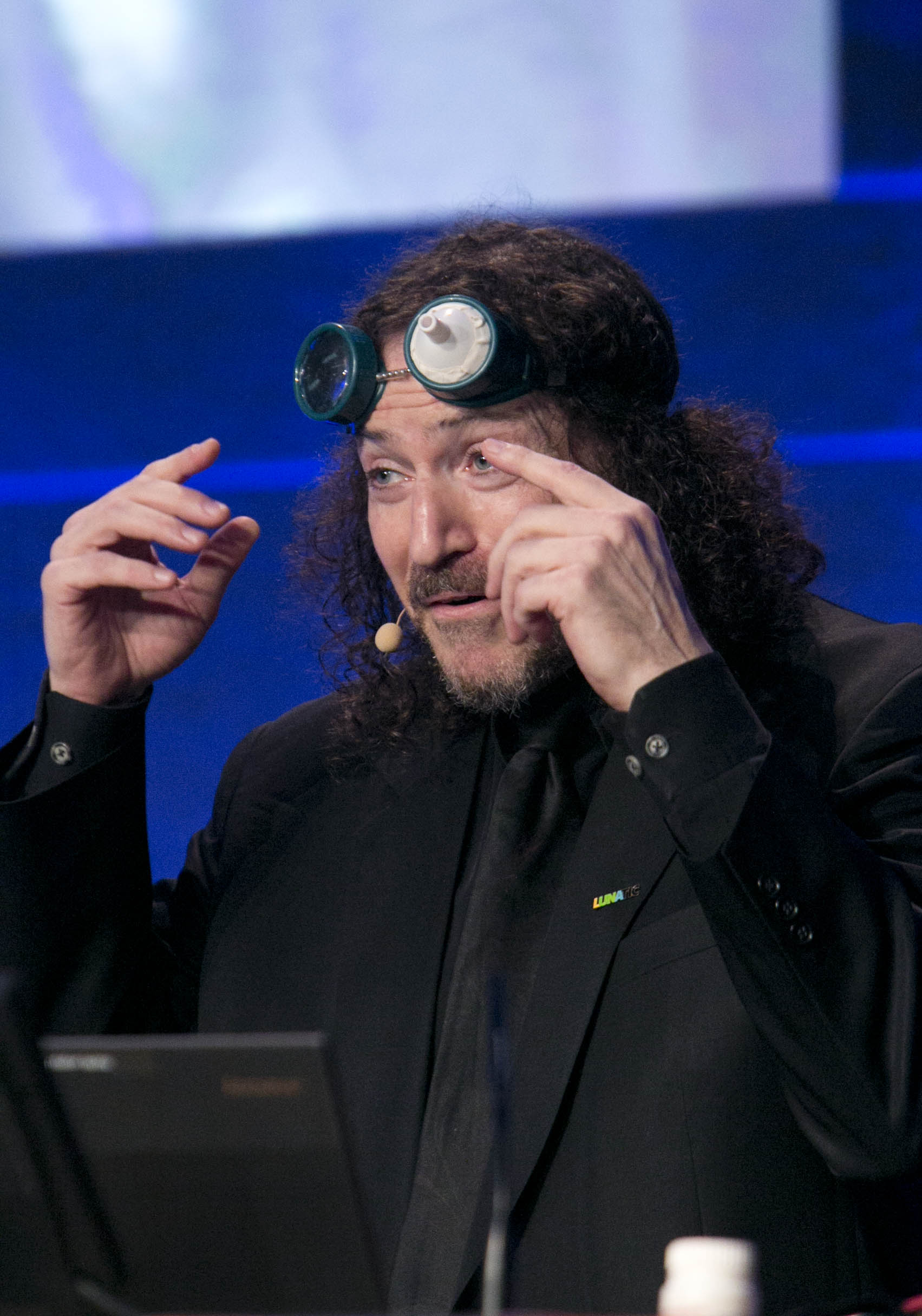
NALA 10th International PLAIN Conference, Dublin Castle.
Picture Colm Mahady / Fennells – Copyright 2015 Fennell Photography (JPG, 1703 × 2432, 375KB)
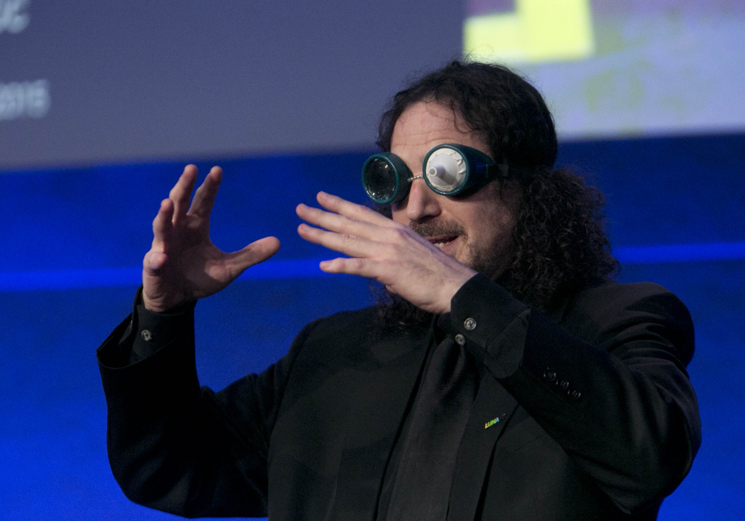
NALA 10th International PLAIN Conference, Dublin Castle.
Picture Colm Mahady / Fennells – Copyright 2015 Fennell Photography (JPG, 2564 × 1795, 386KB)
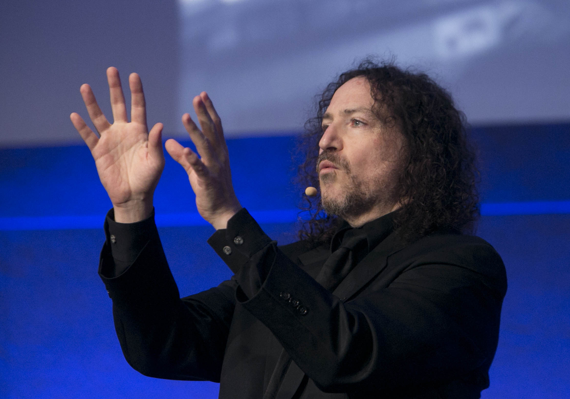
NALA 10th International PLAIN Conference, Dublin Castle.
Picture Colm Mahady / Fennells – Copyright 2015 Fennell Photography (JPG, 2228 × 1559, 271KB)
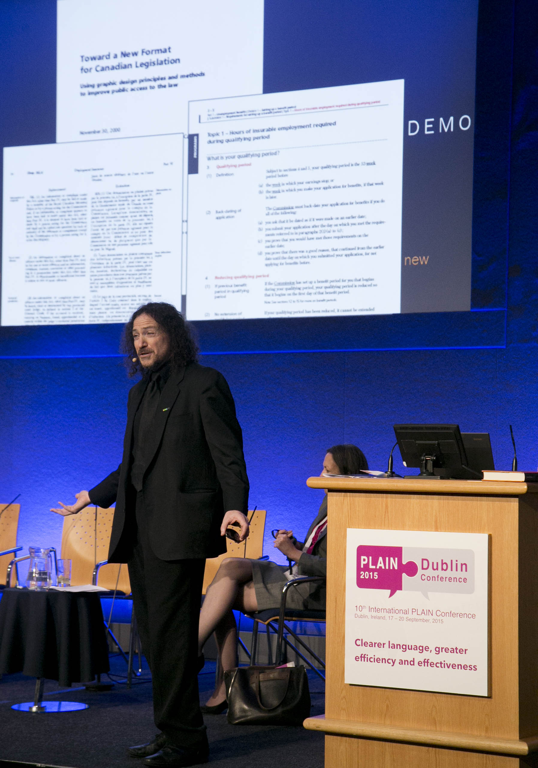
NALA 10th International PLAIN Conference, Dublin Castle.
Picture Colm Mahady / Fennells – Copyright 2015 Fennell Photography (JPG, 1795 x 2564, 439KB)
NALA 10th International PLAIN Conference, Dublin Castle.
Picture Colm Mahady / Fennells – Copyright 2015 Fennell Photography (JPG, 2564 × 1795, 425KB)
NALA 10th International PLAIN Conference, Dublin Castle.
Picture Colm Mahady / Fennells – Copyright 2015 Fennell Photography (JPG, 2564 × 1795, 356 KB)
High-level adviser to the UN, David Berman, spoke at the United Nations conference in Monterrey, Mexico in 2011 on the role of design in creating a better world. (JPG, 842×1862, 488KB)
David explaining on how designing for the extremes benefits everyone. “Color For The Colorblind” keynote, Daegu Design Week, Daegu, Korea, 2009. (JPG, 2622×1741, 2.71MB)
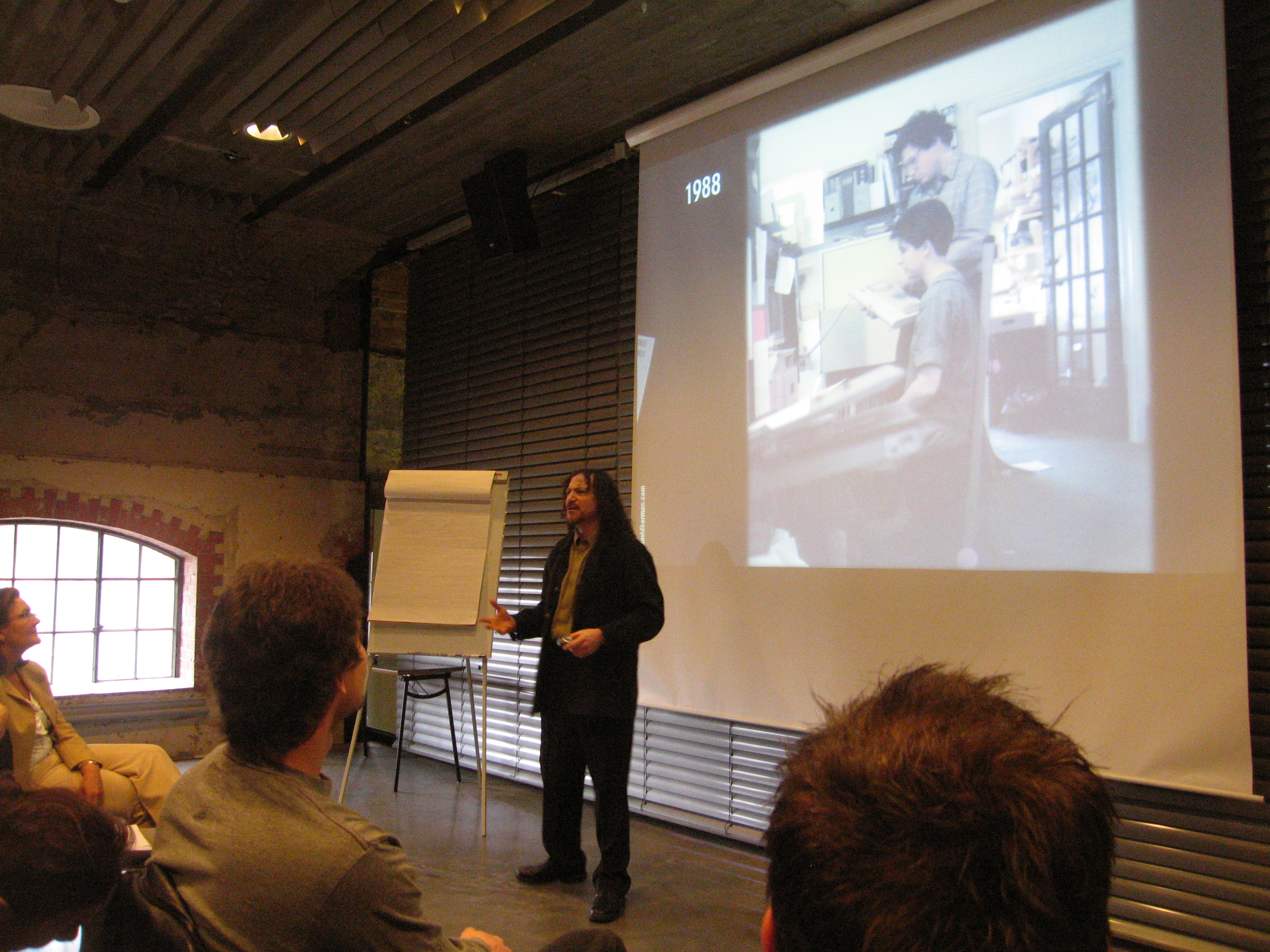
David Berman telling the proud story of certification of the design profession, from Ontario to Norway, to a special Grafill certification conference, Norwegian Design Centre, Oslo, Norway, 2008. (JPG, 3264×2448, 4.40MB)
David keynotes on design ethics at the International Advertising Association’s regional meeting, Bahrain, 2005. (JPG, 3024×2016, 5.07MB)
David keynotes on design ethics at the International Advertising Association’s regional meeting, Bahrain, 2005. (JPG, 3024×2016, 5.31MB)
high resolution (8-bit grayscale JPG, 2100 x 2092, 7″x7″, 300dpi, 1200K)
David Berman – head and shoulders high-resolution (8-bit grayscale JPG, 1458 x 1465,
367K)

David Berman – standing high-resolution (JPG, 457 x 741, 69.5KB)

high resolution (32-bit TIFF, 457 x 741, 1.3 megabytes)
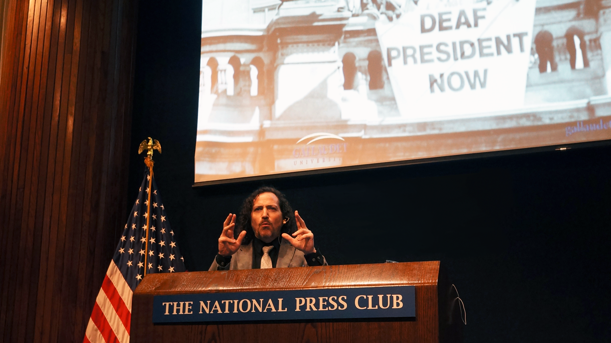
David in Washington giving talk and gesturing behind the National Press Club podium. high resolution (PNG, 2120 × 1192, 3 megabytes)
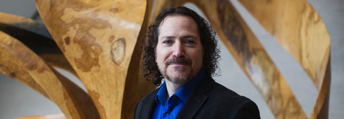
David Berman standing in front of sculpture at Carleton University. Photo by Chris Roussakis (PNG, 1300 × 450, 650 KB)
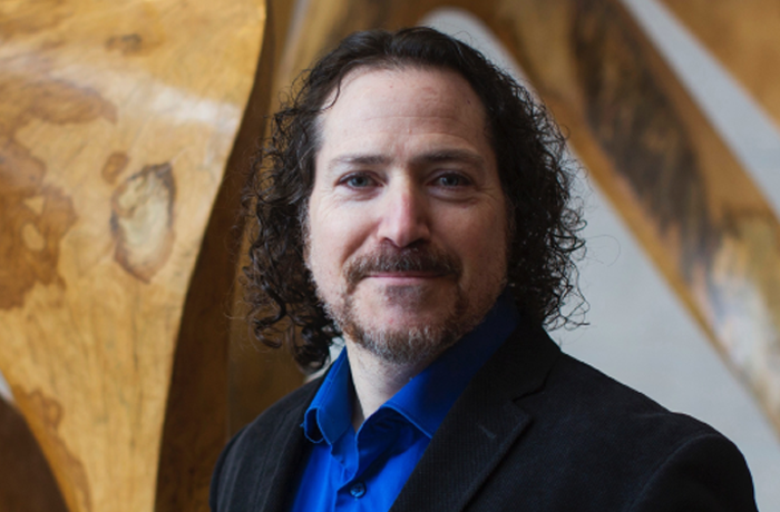
David Berman standing in front of sculpture at Carleton University. Photo by Chris Roussakis (PNG, 700 × 460, 388 KB)
Fee schedule
Keynote: $5,500 to $8,950
Half/full-day course: $6,500 to $9,500
Nonprofit: please ask regarding possible donations
David’s best-selling book: Do Good Design
 Preview the first 30 pages of Do Good Design (Pearson, 2009) Google Books
Client references and testimonials
Shaw Media talks about David Berman Communications onsite accessibility course
Transcript | Shaw Media talks about David Berman Communications onsite accessibility course
This is a transcript of the video Shaw Media talks about David Berman Communications onsite accessibility course.
(TEXT ON SCREEN: David Berman Communications Review, November 15 2016, Shaw Media)
(TEXT ON SCREEN: Andrew Davies, Experience Design Manager, Shaw Media)
(A man in a sweater faces the camera, and continues to do so throughout the video.)
My name’s Andrew Davies, and I’m the Manager of Experience Design for Shaw Media. My team of web designers and user experience designers are responsible for the maintenance and enhancements to all of our brand websites and applications. Those brands include Global TV, Global News, Food, HGTV, Slice, History, and Showcase.
My team will be embarking on a redesign of one of our major branded websites, and there was an opportunity for us to incorporate accessibility as part of this redesign. So essentially David came in for a full day of training for about 30 developers, 10 graphic designers, and my UX team. I was concerned that taking that many people out of their daily work schedule was going to be really hard on the business, and also be hard to keep those people engaged.
David used real-life examples, got people up and interacting. It was an amazing experience. Tremendous amount of feedback. People stayed for the entire session. Often times people would be jumping up for meetings in other full-day sessions. Not the case with David’s.
I’m very confident that moving forward we’re going to be able to incorporate all the best practices to make sure that our new branded websites will be fully accessible, and that we’ll achieve web accessibility accreditation.
(TEXT ON SCREEN: David Berman Communications Review, November 15 2016, Shaw Media)
[END OF TRANSCRIPT]
Testimonial letter from Professor Stephan Pinkau of the Bauhaus School, Germany ![]()
Testimonial letter from Tina Fras, President of the Magdalena festival ![]() [205KB]
[205KB]
Testimonials from David’s keynote at agIdeas Melbourne
About David
“In Yiddish, a mensch is a person of integrity and honor and it seems David Berman fills the bill. Changing the world for the good never seemed more appealingly possible.”
– Edward Asner, former President, Screen Actors Guild
David Berman has been named a high-level advisor with the United Nations on how design can be used to help fulfill the Millennium Development Goals.
David’s recent best-selling book, “Do Good Design; How Design Can Change the World”, was published in January, 2009 by Penguin/Pearson Education, is now available in 4 languages.
https://davidberman.com/social/dogood.php .
David Berman has over 25 years of experience as an internationally renowned author, expert speaker, facilitator /trainer, designer, communications strategist, typographer and consultant. His professional work has brought him to over 20 countries in the past few years.
David Berman provides you the power to be better: fresh and easy techniques to get the most important things done well, in alignment with your mission and values. The combination of his inspiration and techniques motivate people to create unique and ecologically-responsible strategy, events, branding, design, ethics, and communications solutions. He shares knowledge and experience one-on-one or through keynote speeches and courses given around the World.
In 1999, the Society of Graphic Designers of Canada named him a Fellow for his eco-friendly Code of Ethics. David was elected V.P. Ethics of the Society in 2000, and since has served as Ethics Chair. In 2005, he became a Vice-President of Icograda, the World body for graphic design, which organizes global conferences
His clients include IBM, International Space Station, World Bank, Norwegian Design Council, the Aga Khan Foundation, Environment Canada, Health Canada, Parks Canada, Statistics Canada, Treasury Board and others. David’s work includes award-winning projects in the application of plain language, custom typeface design, and the development of a system to republish the laws of Canada in plain writing and design.
Some of the clients and locations David has provided keynotes, workshops, custom training, and courses:
- ACI Manitoba
- Algonquin College
- American Psychological Association (Washington, DC)
- Anhalt University of Applied Sciences
- Arc The Hotel
- Association for Manitoba Archivists
- Association of Registered Graphic Designers of Ontario (RGD)
- Aula Magna CSIC (Spain)
- Bauhaus School of Design (Germany)
- Bluenotes Global 2018 Conference (Louisville, KY)
- Brookstreet Hotel
- Caldas University (Colombia)
- Canadian Association of Professional Speakers
- Canadian Food Inspection Agency
- Canadian Marketing Association
- Canadian Museum of Nature
- Canada Revenue Agency
- Canada School of Public Service
- Carleton University
- Central Academy of Fine Arts (China)
- CapCHI (Computer-Human Interaction)
- Coast Coal Harbour Hotel
- Colorado Convention Center
- Concordia University
- Daegu Conference Center (Korea)
- DDI (Sociedad estatal para el desararrollo del diseno) (Spain)
- Dublin Castle (Ireland)
- CONADIS (Mexico)
- eXplorance Inc.
- Federal University of Pernambuco (Brazil)
- FontShop
- Forum of Federations
- Friction Creative
- Graphic Designers of Canada
- Go Training
- Haus der Kulturen der Welt (Germany)
- Havana Conference Center (Cuba)
- Health Canada
- Honda Canada
- Hong Kong Design Centre (Hong Kong)
- House of Commons
- How Magazine
- Hungarian Academy of Fine Arts (Hungary)
- Icograda
- Indigo Hotel
- Industry Canada
- International Advertising Association (Bahrain)
- International Centre for Creative Innovation and Sustainability (Denmark)
- Internet Institute
- Internet Society Pakistan Islamabad Chapter (Pakistan)
- Jewish Family Services
- Kenyon College
- Kyoorius Designyatra (Grand Hyatt Goa, India)
- Lebanese American University (Lebanon)
- Legal Services Corporation
- London College of Printing (United Kingdom)
- Magdalena Festival (Slovenia)
- Maribor City Hall (Slovenia)
- MaRS Discovery District
- Manitoba Public Insurance (Winnipeg)
- Meeting Planners International
- Multiset Users Group (Seattle)
- National Disability Authority (Ireland)
- National Press Club (Washington, DC)
- National Research Council
- National University at Pernambuco (Brazil)
- Nortel Networks
- North Bay Parry Sound District Health Unit (North Bay, Ontario)
- Omni Hotel
- Ottawa Senators Hockey Club
- Performance Management Consultants
- PPAC/PPPC
- Promotional Products Association International
- ProTech Training (Toronto, Ontario)
- Public Service Commission of Canada
- Public Safety and Emergency Preparedness Canada
- Québec City Tourism
- RGD Web Design Accessibility Conference (Toronto Reference Library)
- Savannah College of Art and Design (SCAD)
- Scotiabank Place
- Shaw Media (Toronto, Canada)
- Sheridan College (Oakville, Canada)
- Society of Graphic Designers of Canada
- Statistics Canada
- Strathcona Hotel
- St. Lawrence College (Kingston)
- Tasmeem Doha
- TYPOBerlin
- Tunney’s Pasture (Ottawa, Canada)
- Union for Democratic Communications
- United Health Group
- University of Toronto
- University of Virginia
- Vancouver Convention Center
- Virginia Commonwealth University (Qatar)
- Virginia Commonwealth University (United States)
- Virginia Foundation for the Humanities
- Windsor-Essex County Health Unit (Windsor, Ontario)
- Yarmouk University (Jordan)
Countries and cities in which David has spoken
- Amman, Jordan
- Atlantic City, NJ
- Banff, AB
- Beijing, China
- Beirut, Lebanon
- Bendigo, Australia
- Berlin, Germany
- Boston, MA
- Brisbane, Australia
- Brno, Czech Republic
- Budapest, Hungary
- Buenos Aires, Argentina
- Cairo, Egypt
- Calgary, AB
- Charlottesville, VA, USA
- Copenhagen, Denmark
- Daegu, South Korea
- Delhi, India
- Denpasar, Bali, Indonesia
- Denver, CO, USA
- Dessau, Germany
- Doha, Qatar
- Dublin, Ireland
- Eugene, OR, USA
- Fredericton, NB
- Goa, India
- Halifax, NS
- Havana, Cuba
- Helsinki, Finland
- Hong Kong, China
- Hornbaek, Denmark
- Ibri, Oman
- Irbid, Jordan
- Istanbul, Turkey
- Jakarta, Indonesia
- Kingston, ON
- Kuala Lumpur, Malaysia
- Kuwait City, Kuwait
- Las Vegas, NV, USA
- Louisville, KY, USA
- London, UK
- Madrid, Spain
- Manama, Bahrain
- Manizales, Colombia
- Maribor, Slovenia
- Melbourne, Australia
- Mexico City, Mexico
- Mississauga, ON
- Moncton, NB
- Monterrey, Mexico
- Montreal, PQ
- Mumbai, India
- Muscat, Oman
- Nanaimo, BC
- New York, NY, USA
- New Orleans, LA, USA
- Oklahoma City, OK
- Orlando, FL, USA
- Oslo, Norway
- Ottawa, Canada
- Penang, Malaysia
- Quebec City, QC
- Recife, Brazil
- Regina, Canada
- Richmond, VA, USA
- San Francisco, CA, USA
- Sarasota, FL, USA
- Scottsdale, AZ, USA
- Seattle, WA, USA
- Stuttgart, Germany
- Sydney, Melbourne, Adelaide, Brisbane (Australia)
- Taipei, Taiwan
- Torino, Italy
- Toronto, ON
- Tunis, Tunisia
- Ubud, Indonesia
- Vancouver, BC
- Victoria, BC
- Vilnius, Lithuania
- Washington, DC, USA
- Winnipeg, MB
- Yogyakarta, Indonesia
Reviewed January 1, 2018