Many consider David Berman’s knowledge of typography, which he has taught as part of college curricula, to be unmatched in the National Capital Region. He has been a frequent speaker on type technology issues at typographer meetings in the United States and Canada.

Detail from David Berman's early sketches for his Culture typeface
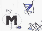
Another detail from David Berman's early sketches for his Culture typeface
As a teenager, he created and produced a print magazine distributed in four countries. While studying computer science at the University of Waterloo and psychology and typography at Carleton University, he became intensely involved with the student press, introducing microcomputers for the first time to the typesetting of student newspapers in Canada.
He then established and operated Ottawa’s first ad typography studio (the type previously only found in places like Toronto, New York and Chicago) which flourished throughout the 1980s then adapted to the advent of electronic publishing.
His experience in typography includes custom font development for the Canadian government, Nortel and the CBC, technical typeface reconfiguration for NAV Canada, and the development of a font to mimic the handwriting of Lynn Johnson for international syndication of the comic strip For Better Or For Worse.

David chose Cartier, a Canadian typeface by Carl Dair, for the Canadian Charter of Rights and Freedoms
David is proud to have styled the type, using the Canadian typeface Cartier, for the official version of the Canadian Charter of Rights and Freedoms.
Reviewed January 2, 2012